![Ayyekas-Logo_Horizontal-1062x400.png]](https://www.ayyeka.com/hs-fs/hubfs/Ayyekas-Logo_Horizontal-1062x400.png?width=105&height=40&name=Ayyekas-Logo_Horizontal-1062x400.png)
Key Benefits
- Map Navigation - Zoom and pan the map with minimum lag for faster navigation and better viewing (maps are built with MapBox)
- Wavelet Filtering - Display specific Wavelets based on search criteria
- Wavelet Detailed View - Access a summary of a Wavelet's status and monitored streams
- Quick View - Analyze sensor data from up to 4 streams directly on the map, without leaving the page
- Area Averages - Color geographic regions by average device health or any custom stream value
- Weather Overlay - Toggle a live precipitation radar layer on the map
- Clustering Control - Turn automatic grouping of nearby Wavelets on or off
How to Access
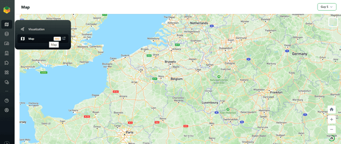
Navigate to the Map page via the left navigation bar: (Menu) > Map > Map
Workflow
- Navigate the map
- Customize the map display
- Use the map toolbar (area averages, weather overlay, clustering)
- View Wavelet details
- Analyze streams in Quick View
Navigate the Map
To navigate the map:
- Click + and - (bottom right corner) to zoom in or out.
- Hold the left mouse button and drag to pan around the map.
Customize the Map Display
Search
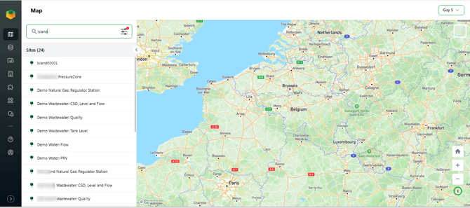
Type a Wavelet name or ID in the search bar at the top of the left panel to filter the device list.
Filters
Click the filter icon (sliders icon) next to the search bar to open the Filters panel. A red indicator on the icon means one or more filters are currently active.
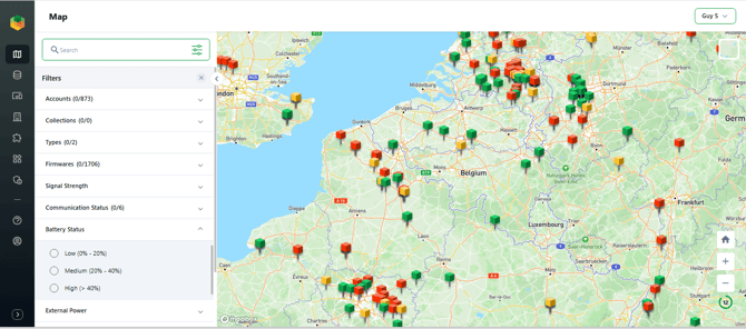
Available filters:
| Filter | Description |
|---|---|
| Accounts | Filter by account (relevant for multi-account access) |
| Collections | Filter by device collection |
| Types | Filter by device type |
| Firmwares | Filter by firmware version |
| Signal Strength | Filter by current signal quality |
| Communication Status | Filter by connection state |
| Battery Status | Low (0-20%), Medium (20-40%), High (>40%) |
| External Power | Filter by external power source status |
| Humidity | Filter by humidity classification |
| Custom Attributes | Filter by any custom attributes defined for your devices |
Click Apply to update the map. Click Reset to clear all active filters.
Map Toolbar
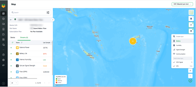
A set of layer controls sits in the top-right corner of the map. Each control can be toggled independently; a green indicator dot shows when a layer is active.
Area Averages Layer
Colors geographic regions (countries, states, counties, or districts, depending on zoom level) based on the average sensor reading of devices located within each area.
How it works:
- Click the Layers button to open the stream type picker.
- Select a built-in health indicator or any custom numeric stream type configured in your account (flow rate, pressure, temperature, etc.).
- Regions update immediately, without reloading the map.
- Select Disable layer from the same menu to turn it off.
Built-in types:
| Type | Good (Green) | Warning (Yellow) | Critical (Red) |
|---|---|---|---|
| Battery | > 40% | 21-40% | <= 20% |
| Signal Strength | > 70% | 41-70% | <= 40% |
| Communication Status | Scheduled / Early / Resumed | Delayed | Interrupted / Hibernated |
| Humidity | <= 20% | 21-50% | > 50% |
Devices with no reading for the selected stream type are excluded from the area average.
Custom stream types:
- Any numeric stream type available in your account can be selected from a searchable list in the same menu.
- Regions are colored on a blue-to-amber-to-red gradient representing low to high values.
- The legend (bottom-left) shows the gradient scale with min/max values and units.
- Corrupted or missing sensor values are automatically excluded from the average.
Viewing details:
- Click a colored region to open a popup showing the area name, stream type, overall status, and a per-device breakdown with individual readings and last-seen timestamps.
- Devices with no data appear in a collapsible "No data" section within the popup.
- Click any device row in the popup to open that Wavelet in the left panel.
Geographic resolution:
The map automatically switches boundary resolution based on zoom level:
| Zoom level | Boundaries shown |
|---|---|
| World view | Countries |
| Regional | States / provinces |
| City | Counties / districts |
| Street | Census tracts / local admin areas |
Weather Overlay
Toggle a live precipitation radar layer on or off using the water-drop icon in the map toolbar.
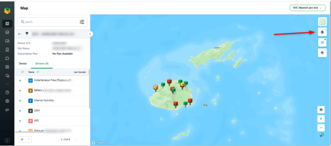
- When enabled, a semi-transparent rain/precipitation overlay appears on the map, sourced from a global radar feed showing the most recently available snapshot.
- The overlay sits beneath Wavelet markers and map labels, so nothing is obscured.
- The overlay persists when switching between map styles.
Clustering Toggle
Turn automatic grouping of nearby Wavelets on or off. Clustering is enabled by default.
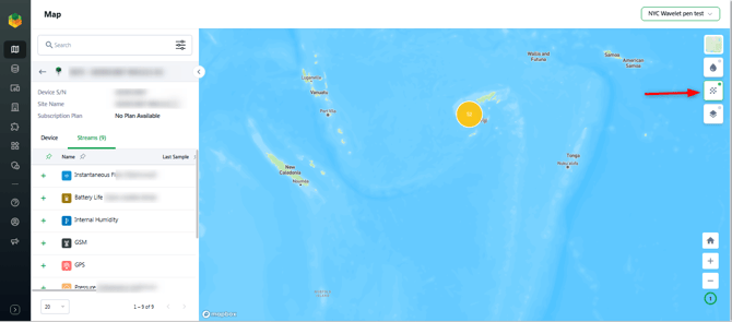
- On (default): Wavelets within close proximity are grouped into a single circle showing the site count. The cluster color reflects the worst status within the group (red if any Wavelet has a critical status, yellow if any has a warning, green if all are normal). Clicking a cluster zooms in and expands it.
- Off: All Wavelets are shown as individual markers regardless of density.
- Clusters form once 50 or more Wavelets overlap within the cluster radius; smaller groups always display as individual markers.
Wavelet Markers
Wavelet markers on the map reflect the device's current operational status based on four parameters: Battery Status, Signal Strength, Communication Status, and Humidity.
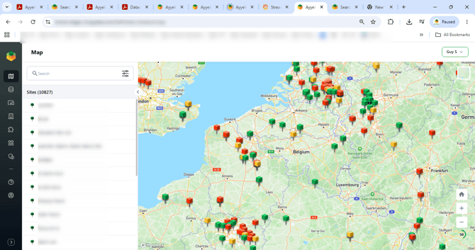
Marker Color Logic
| Marker | Conditions | Meaning |
|---|---|---|
| Green | Battery > 40%, Signal > 70%, Communication: Normal / Early / Resumed, Humidity > 50% | Wavelet is operational |
| Yellow | Battery > 20% and <= 40%, Signal 40-70%, Communication: Delayed, Humidity > 20% and <= 50% | WARNING - one or more parameters need attention |
| Red | Battery <= 20%, Signal <= 40%, Communication: Interrupted or Hibernated, Humidity <= 20% | EMERGENCY - high-level maintenance required |
| Grey | Ultra-low power mode is ON | Wavelet is hibernating to conserve battery |
Additional Marker States
- Selected marker (any color) - A target ring appears under the selected Wavelet
- Marker with transmission waves (any color) - The Wavelet has transmitted data within the last 5 minutes
View Wavelet Details
Click a Wavelet on the map (or in the device list) to open the detail panel on the left. The panel has two tabs: Device and Streams.
Device Tab
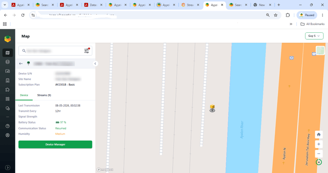
Displays the current operational status of the selected Wavelet:
| Field | Description |
|---|---|
| Device S/N | Hardware serial number |
| Site Name | The site this device is assigned to |
| Subscription Plan | Active subscription tier |
| Last Transmission | Timestamp of the most recent data transmission |
| Transmit Every | Configured transmission interval |
| Signal Strength | Current cellular signal quality |
| Battery Status | Battery level with color indicator |
| Communication Status | Current connection state (e.g., Resumed, Delayed, Interrupted) |
| Humidity | Environmental humidity classification |
Click Device Manager to open the full configuration page for this device.
Streams Tab
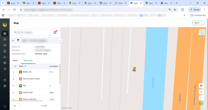
Lists all data streams configured for this Wavelet, with the most recent sample value for each.
- Click + next to a stream to add it to the Quick View chart below.
- Up to 4 streams can be selected at one time, from one or more Wavelets.
- Selected streams show a checkmark. Click the checkmark to remove a stream from the chart.
- If you attempt to add a 5th stream, an error notification appears: "We only allow maximum 4 selected streams."
- To add streams from a second Wavelet, click the back arrow (<) to return to the device list, select another Wavelet, and add streams from its Streams tab.
Quick View
When at least one stream is selected, the Quick View chart appears at the bottom of the screen. The map remains visible above it.
![SCREENSHOT 7 Quick View chart open with streams selected, date range buttons visible]](https://www.ayyeka.com/hs-fs/hubfs/KB%20Graphics/SCREENSHOT%207%20%20Quick%20View%20chart%20open%20with%20streams%20selected%2c%20date%20range%20buttons%20visible%5D.png?width=670&height=353&name=SCREENSHOT%207%20%20Quick%20View%20chart%20open%20with%20streams%20selected%2c%20date%20range%20buttons%20visible%5D.png)
Date Range
Select a preset time window:
1h | 3h | 12h | 1d | 3d | 1w | 2w | 1M | 3M | 6M | 1y | 2y | 3y
To set a custom range, click Date range (pencil icon) and enter your start and end dates.
Zooming and Resizing
- Zoom the chart - Hold Ctrl and scroll the mouse wheel while hovering over the chart area to zoom in or out on the time axis.
- Resize the Quick View panel - Hold Ctrl and scroll the mouse wheel while hovering outside the chart area (but within the Quick View panel) to increase or decrease the panel height.
Aggregation
By default the chart shows raw data. To group data into intervals:
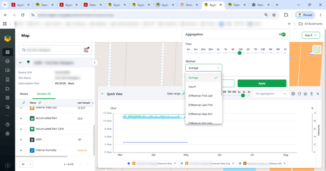
- Click the No aggregation dropdown (top right of the chart).
- Select a Time interval: 1m, 5m, 15m, 30m, 1h, 3h, 6h, 12h, 1D, 7D, 14D, 1M, 3M, or 1Y.
- Select a Method:
| Method | Description |
|---|---|
| Average | Mean value per interval |
| Count | Number of samples per interval |
| Difference: First-Last | Change from first to last sample in the interval |
| Difference: Last-First | Change from last to first sample in the interval |
| Difference: Max-Min | Spread between highest and lowest value |
| Difference: Min-Max | Same spread, inverted sign |
- Click Apply.
Chart Settings
Click the gear icon to open chart settings:
![SCREENSHOT 9 Settings dialog showing Smooth line toggle and Y-Axis Arrangement section]](https://www.ayyeka.com/hs-fs/hubfs/KB%20Graphics/SCREENSHOT%209%20Settings%20dialog%20showing%20Smooth%20line%20toggle%20and%20Y-Axis%20Arrangement%20section%5D.png?width=670&height=353&name=SCREENSHOT%209%20Settings%20dialog%20showing%20Smooth%20line%20toggle%20and%20Y-Axis%20Arrangement%20section%5D.png)
- Smooth line - Toggle to display smoothed curves instead of raw point-to-point lines.
- Y-Axis / Arrangement - Assign each selected stream to a Y-axis position (Left Axis, Right Axis 1, or Right Axis 2). Useful when comparing streams with different units or scales.
Click Update to apply changes.
Summary Panel
The Summary panel appears on the right side of the Quick View. It displays MIN, AVG, and MAX values for each selected stream over the currently selected date range.
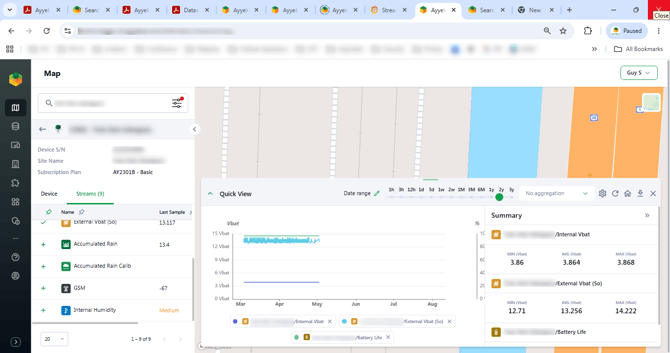
Quick View Toolbar
| Icon | Action |
|---|---|
| Gear | Open chart settings |
| Refresh | Reload chart data |
| Home | Reset chart zoom to default view |
| Download | Save the chart as a screenshot |
| X | Close the Quick View panel |